20 Great Button Badge Design Ideas - Part 1
25 May 2021
Getting the right design for your button badge is all important. Here to help with your inspiration is part one of our guide to badge design.
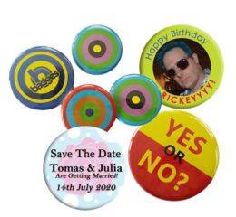
#1 The Photo Badge
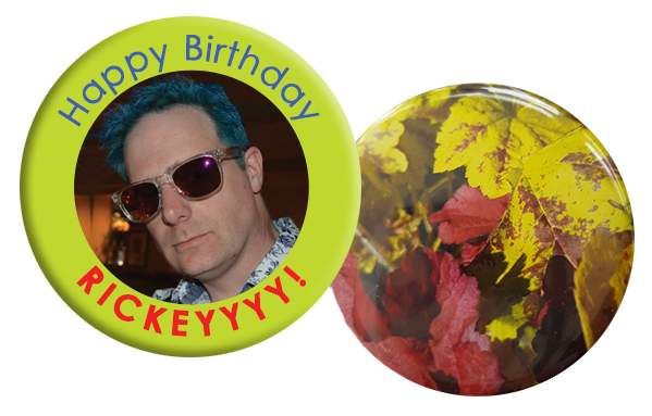
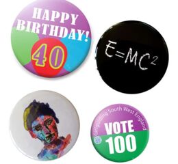
Photographs on badges make great use of the print capabilities, allowing you to fix your memories in place or to make a full colour splash with your design.
Especially popular are photographs to celebrate a loved one, such as personalised birthday badges. Text can easily be added to include a special message. Events too can be celebrated with a well chosen photograph and a carefully written message.
Photographs of course can be an important element of any design, especially on larger sizes of badges where the imagery can be enjoyed to its best effect. Lots of successful designs combine photographic imagery with simply messaging contained in a few words.
Button fridge magnets work brilliantly with photographs too – why not share a special photo with your friends in a format that they can see every day?
#2 Fun with Circles
Most badges are circular, so why not get a bit loopy and play with circles in your design?
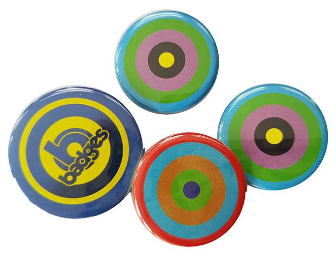
Using circles within a badge design is a very natural and effective idea. The circles within the design can play on the shape of the badge itself, adding a border effect or echoing the roundness of the badge!
Try positioning your logo inside a circle, or overlapping the edges of a circle, or even use multiple overlapping circles for ultimate loopiness.
A word of caution though: there is a very small tolerance in the positioning of artwork on the badges, which can have an effect when a circle is printed near to the edge of the badges. The print tolerance is less than one millimetre, which is generally almost impossible to discern. But when a circle is printed very close to the edge of the badges, even a tiny movement in the artwork can be visible. So if you are looking for perfection with less a millimetre of tolerance, it is best to avoid the circle at the edge of the badge!
#3 The 50-50 Split
Splitting your badge using two contrasting block colours is a neat design trick that adds instant impact.
This design concept is ideal if you are presenting two well defined choices or separate messages, but is used much more widely because it helps the viewer to easily absorb the information by breaking it into easily digestible chunks.
For example, a company logo can sit on the top half of the split with the slogan on the bottom half. Or the headline message can appear on the top with the secondary information in the bottom half.
Another common use of the split background design trick is with name badges. The name can sit in one delineated area which draws the eye, with the company logo in a different colour area.
#4 Get the Font
Choosing the right font can make all the difference to the success of your badge design.
Fonts have a huge role to play in the communication of any message. Some fonts are designed to be functional, easily understood and not cause any extraneous distraction. Other fonts have a particular specific intent, but many are much more subtle in their effect and dependent on our prior experiences with the typeface.
Fonts can be formal or informal, simple or fussy, gentle or angry, and the tone of a sentence can be set as much by the font as by the actual words that are used. A font can add drama or induce calmness, suggest professionalism or fun, creativity or reliability.
Often fonts will also reference other things, perhaps without us being conscious of it. The fonts used by large brands, famous films, street signs or even internet memes seep into our unconscious and when those fonts are used in other design work we can’t help but be influenced by our prior exposure – whether we are aware of it or not.
Some fonts have been so over used that we can’t see them without remembering our early experiences with a computer word processor or typing a piece of homework. Some are so ubiquitous that they almost disappear.
Whichever font you choose, it is worth thinking about the implications and insinuations that will be passed to the viewer.
#5 Save the Date
A great use of badges is as a reminder to save a special date. Save the Date button badges are popularly used as fridge magnets, fitted with a fridge magnet back instead of a pin.
If you have a special date
that you would like people to keep clear in their calendars, then a badge or
fridge magnet is a lovely token that you can send ahead of an invitation. It
becomes a keepsake in itself as well as serving its essential purpose.
If you are designing a Save
the Date badge or magnet, you can opt for a traditional theme or you can let
your imagination loose. Creativity can work especially well if your event has a
particular theme! But even without a theme, think about incorporating something
special to you in the artwork – such as a particular choice of flower or a
colour scheme.
Don’t forget to include
your date nice and clearly!